Components
Log in to add to favouritesPage last updated 02 October 2024

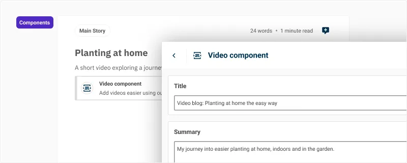
Components offer the ability to add additional structured content to a Canvas that isn't possible from an existing content block. For example if you want to include a carousel, an accordion, or a promoted product slider in the middle of your content, you can easily add these using existing components from your content models.
The component will be displayed as a simple list card, leaving the rendering up to your front-end development team.
Add a component to the canvas
Type /component and press Enter. A window will be displayed where you can choose the component you want to insert.
If you have restricted the components in you canvas configuration, then you can also type /{componentname} in the editor to directly insert a component by name, for example /accordion.
Edit a component
- With a component inserted in the Canvas, press the Edit button from the block toolbar. The component will open up for editing in the flyout editor.
- With the component focused, press Enter and the component will open for editing.
- Alternatively, double click the component to edit its content.
Delete a component
- If you no longer require the component in the Canvas, press the Delete button in the block toolbar.
- Pressing Del or Backspace with the block focused will remove the component and its content from the Canvas.
- You can also use the actions menu by pressing
Command/Control+/and selecting delete from the menu.

