Open to all: Why every organisation needs an accessible website


“The one argument for accessibility that doesn’t get made nearly often enough is how extraordinarily better it makes some people’s lives. How many opportunities do we have to dramatically improve people’s lives just by doing our job a little better?” – Steve Krug, UX expert
Acknowledgements
A special thank you to Mike and Gavin at the Digital Accessibility Centre for their input and continued partnership with Contensis and many thanks to Liam O'Dell for his first-person perspective and support in creating this content.
Contents
Chapter 2: The case for accessibility
Chapter 3: First-person perspective: Liam O'Dell
Chapter 4: Navigating web accessibility standards
Chapter 5: Building accessible content
Chapter 6: What does good look like?
Chapter 7: Testing and evaluating accessibility
Chapter 1: Introduction
As we move to an almost cashless and paperless society, organisations may forget that millions of people struggle to use websites and apps. Some 10 million people in the UK are classed as ‘digitally excluded’ because they don’t have the skills, motivation, confidence or access to technology that would allow them to find essential information and get cheaper deals on anything from holidays to insurance.
But there are also millions of people who are digitally excluded because they cannot access websites due to impaired vision, motor difficulties, cognitive difficulties, learning difficulties, or impaired hearing.
Since 2018, organisations in the public sector have been required by law to meet accessibility standards and face enforcement action if they fail to do so. UK businesses, on the other hand, are not governed by these rules, unlike in the US, where accessibility is a requirement in both the public and private sectors.
Of course, there is a clear ethical incentive for businesses to invest in website accessibility. No responsible company would want disabled and potentially vulnerable people to be cut off from vital services, like banking, energy, telecoms and retail, nor excluded from competitive prices.
But there’s a commercial urgency, too. With the public sector raising the bar on website accessibility, businesses that don’t meet customers’ expectations won’t fully unlock the value of the ‘purple pound’ – the spending power of disabled households, which is estimated to be worth £274 billion.
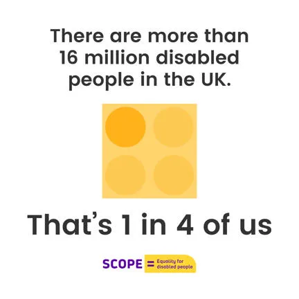
There are more than 16 million disabled people in the UK today, and the number of people experiencing visual, cognitive or hearing difficulties is only going to rise as the population ages. But there are many more who struggle with accessibility due to a temporary disability, such as an injured arm, or situational impairment like holding a baby.
The features that characterise an accessible website – easy-to-use navigation, well-written content, etc. – can benefit all users, whether they have a permanent, temporary or no disability.
Website accessibility is a relatively small yet potentially powerful area of investment for businesses. By developing their websites and content to cater to the needs of disabled people, they are demonstrating that they genuinely value inclusivity rather than just saying they do.
In this eBook, we’ll look at:
- The technical and content requirements for an accessible website.
- The benefits it brings.
- And why accessibility should be a priority right from the start of the project through the planning, design and delivery stages and not sidelined.
We’ll hear from experts at Zengenti and a first-person perspective from Liam O'Dell, an award-winning freelance journalist and campaigner specialising in deafness, disability and social media.
Chapter 2: The case for accessibility
User experience (UX) has become a buzzword in recent years – and for good reason. Prioritising the user and their needs, in both the design and content of a website, encourages engagement and action, and reduces frustration and drop-offs.
Tech companies and e-commerce giants have led the way on UX, but they’re not the only ones. Some of the UK’s leading charities, aware that they need to communicate with a wide range of supporters and service users, including disabled people, have also invested heavily in UX.
But just because an organisation has prioritised UX doesn’t mean that their websites are always accessible to people with disabilities. While a visually appealing site with well-written content is a step in the right direction, true user-centric design takes into account the needs of users with disabilities and other accessibility issues, such as slow internet speeds.
The World Wide Web Consortium (W3C) Web Accessibility Initiative (WAI) sets the Web Content Accessibility Guidelines (WCAG), which are an internationally recognised set of recommendations for improving web accessibility.
What disabilities impact access to websites?
- Auditory: Individuals can experience varying degrees of hearing loss, whether temporarily due to an infection or blocked ear or because they suffer from mild hearing loss or profound deafness. This makes it difficult to access video and audio.
- Visual: People with visual impairments may be unable to read website text without the help of a screen reader or because of the typography, font size or colour contrast chosen.
- Cognitive: Broadly speaking, a cognitive disability impacts a person’s ability to think or process information. This could be due to a condition such as dementia, a mental illness, autism, or intellectual disability.
- Neurological: Because many neurological conditions affect the brain, there is a cross-over between neurological and cognitive disabilities. Neurological disabilities can therefore, include conditions like dementia or autism, but one of the most common is migraine.
- Physical: Since physical disabilities can impact motor skills and mobility, navigating websites with small buttons or intricate interactions can be challenging for individuals with limited dexterity or mobility impairments.
- Speech: Including stuttering, apraxia and difficulties linked to other conditions such as deafness, people with speech impairments can be excluded from voice-activated technologies.
Source: W3C
As the W3C makes clear, an accessible website benefits a diverse range of people using an ever-increasing number of devices, even if they don’t have a registered disability (someone who has lost their glasses, for instance).
It can also improve the experience of people using small screen devices, such as smart watches, or those with situational limitations like slow internet speeds or because they’re in a place where they can’t listen to audio or use voice recognition.
Why now?
The digital and social landscapes are changing quickly as more of us live our lives online and more people manage some kind of disability.
Being ethical and responsible is a powerful incentive in its own right, as is the value of the purple pound. However, there is a clear link between website accessibility and commercial success – for instance, the Click-Away Pound Survey revealed that 71% of disabled users with access needs will leave a website that they find difficult to use. That can easily equate to lost sales and missed opportunities to grow loyalty.
Businesses may not always be aware that potential customers are abandoning their website because it is difficult to use. But a growing movement of disability rights advocates – particularly on social media platforms like Instagram and TikTok – are giving a voice to disabled people, highlighting the challenges they face and making organisations sit up and listen.
What the law says
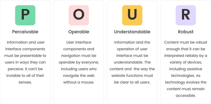
The Public Sector Bodies Accessibility Regulations (PSBAR) came into force for public sector organisations in 2018, requiring organisations to ensure their websites and apps are ‘perceivable, operable, understandable and robust’, these four accessibility principles are also known as POUR. More information can be found on those in Chapter 5.
Public sector organisations must comply with the WCAG 2.1 AA accessibility standard, and publish an accessibility statement explaining how the website/app is accessible. Even so, the government reports that as many as one-in-four council homepages fail to meet accessibility standards.
Organisations in the private sector don’t have the same legal obligations, although we have seen there are clear ethical and commercial reasons for investing in website accessibility.
The public sector has set the standard for website accessibility, and consumers, whether they are disabled or not, are demanding the same from the private sector.
While the private sector may not need to comply with PSBAR, there are other laws to take into account – notably, the Equality Act 2010, which requires organisations to make reasonable adjustments including providing accessible services and communications.
Not only that but people have also become accustomed to accessible experiences on the government, NHS and many other public sector websites – and they increasingly expect the same when they’re shopping or banking online.
Chapter 3: First-person perspective: Liam O'Dell
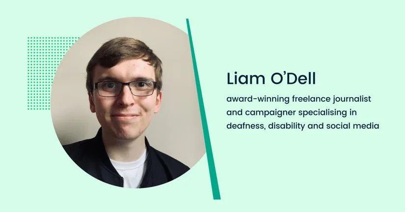
Liam O’Dell is an award-winning freelance journalist and campaigner specialising in deafness, disability and social media. Here, he discusses some of the common barriers facing disabled people face online, how negative experiences impact customer journeys, and which brands are leading the way on accessibility.
"One of the biggest barriers I keep witnessing from businesses is that they fail to understand that their website is part of a user/customer journey," Liam says.
"Companies go some way towards making their social media content accessible to draw attention to a product or service, but when you go to their website to find out more or make a purchase, a poor site map and user interface means it’s impossible to find out more information. I’ve seen this, particularly with some theatre and cinema sites. A failure to make the whole user journey accessible opens businesses up to accusations of tokenism and performative accessibility when they should be seen as taking customer access seriously." says Liam.
"In terms of social media, there have been improvements in recent years, not least because many platforms have an autoplay feature, which means videos initially play without sound, mandating the need for captions. However, the automatic captions generated by Instagram aren't always accurate or reliable, which is why I’ve been calling on BBC News to caption its Instagram videos in-house."
"Technology is evolving at a considerable pace – but I think it’s important to step back and make sure everyone can access information. While it can take time to meet the accessibility requirements, it’s time well spent because accessibility benefits everyone."
"When it comes to alt text on websites, disability charities have recently had to remind organisations that this is not a place for additional copy or ‘secret jokes’. Some companies continue to view accessibility tools as a branding opportunity – for ‘jokes’, one-word captions, bright colours and more – when they should appreciate that they’re there to serve the purpose of making content accessible. That’s it." Liam says.
"On the other hand, I’ve been incredibly fortunate in that I’ve had many positive online experiences. Innocent Smoothies is often cited by disabled people as an example of social media accessibility done right. They provide alt text on all of their images in a way which keeps in line with their branding without sacrificing access. Following a recent website rebrand, the National Theatre has been excellent in having a uniform approach to accessibility across all social media and its website, which is easy to navigate."
"Technology is evolving at a considerable pace – but I think it’s important to step back and make sure everyone can access information. While it can take time to meet the accessibility requirements, it’s time well spent because accessibility benefits everyone."
Liam recommends
I’d always say that those with a lived experience of disability should lead discussions around accessibility, so businesses should be following plenty of disabled activists and content creators for tips and advice – many of them can carry out audits for a fee too. I also have a guide to making your social media content accessible on my website.
You’ll find further resources and reading at the end of this report.
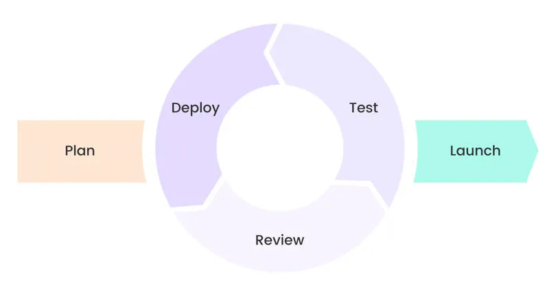
Despite the benefits it can bring, website accessibility isn’t always a priority on web projects, or else it is considered an afterthought – something that could be ‘retrofitted’ once the site is live. In other cases, accessibility might have formed part of the initial plans but is deprioritised mid-way through the project in order to stick to the agreed timelines and budgets.
Unless organisations build accessibility into every part of planning, design and delivery, they risk high costs later down the line.
Not only do they face losing business by excluding so many potential customers, but it also requires more technical resources to bring the website up to accessibility standards.
They may need to rewrite some of the original code, which requires another round of testing and validation and may cause other issues with the website.
By working iteratively and collaboratively, developers, designers and content creators can make accessibility improvements at the end of each sprint instead of waiting until the end of the project.
Where to start?
The W3C has produced a reference guide setting out the requirements for WCAG. It covers everything from text alternatives to the use of colour to timeouts. With so many considerations, some obvious and others less so, it’s easy to see why leaving accessibility until the end of a project could cause so many delays and challenges.
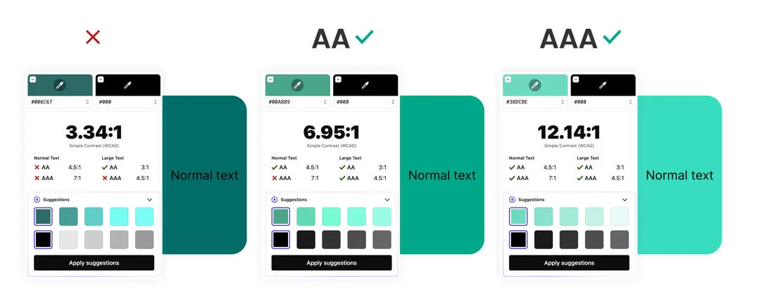
Compliance standards
There is a set of testable success criteria for every guideline the W3C sets out, and three compliance standards. Public sector organisations are required to achieve Level AA, so it’s a good standard for any business to aim for.
Level A: The basic minimum requirement for accessibility is that the website would include alt text, video captions, and be accessible via a screen reader.
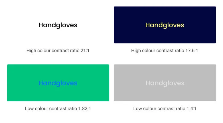
Level AA: Strong accessibility; the website satisfies all the Level A criteria plus additional requirements – for example, text and images of text should have a contrast ratio of at least 4.5:1.
Level AAA: The gold standard, although it is not expected on every part of a website. It includes sign language interpretation on video and a colour contrast of at least 7:1 in most cases.
The WCAG provides a comprehensive overview of the requirements for accessibility – but with so much to consider, it’s easy to see why web teams might see it as an obstacle rather than an opportunity. Building these requirements into every part of the development roadmap helps to ensure that nothing is missed, and can save a lot of time and money in the future.
Everything in this guide has been written with the WCAG in mind. You can find more details on how to apply in them in our further reading section at the end.
Chapter 5: Building accessible content
There are four principles for accessible content, captured in the previously-mentioned POUR acronym (perceivable, operable, understandable and robust), that are detailed in this checklist from WebAIM, which works with organisations to improve web accessibility with tools, training and resources.
For content to be perceivable, users must be able to use different senses, including hearing and touch as well as sight, to access it.
Content is operable when people can use it in the way they need to – for example, whether the buttons are big enough for someone with a visual impairment or who isn’t using a mouse.
Understandable content is clear, jargon-free and easy to digest, while a robust website supports assistive technologies.
POUR is an extensive list, so we have taken elements from it and created the following tips to help you get started.
Make sure the navigation is intuitive.
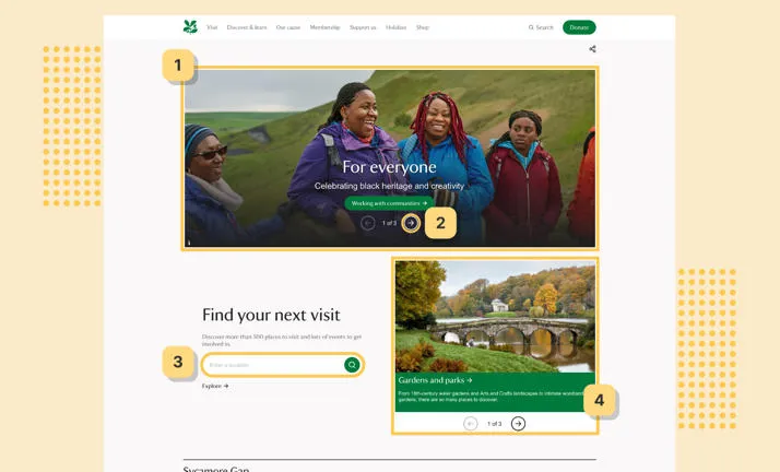
Start by structuring your site to allow users to navigate through it in the most logical way. Many e-commerce sites are already performing well on this front because they recognise that it drives sales, but another good example is the National Trust website. Topics are clustered in a logical way and can be navigated using a keyboard alone.
Structure your content
Before creating content, teams first need to work out how to structure it in a logical way for their websites, apps and other channels. This will save time further down the line, helping to ensure anyone who creates content in the future does so with accessibility built in.
Start by defining the types of content you have on your website – blogs, product listings, landing pages and so on. Within your CMS, you can add constraints or rules, such as limiting page titles to 120 characters to aid readability and setting a requirement for the number of images that should be added as well as ensuring that alt text is used.
Use plain language
As mentioned previously, you can include certain constraints to help ensure content structure meets accessibility standards. But where different parts of a website are being updated regularly – as is the case of blogs/news, and product listings – staff should ensure that content is written in a consistent and easy-to-understand way.
According to the WCAG requirements, it should demand a ‘reading ability more advanced than the lower secondary education level’ (nine years of schooling).
Plain English is a requirement for government content in the UK – which means avoiding jargon, and long sentences, and conveying information accurately without losing the meaning.
Its content design page provides plenty of tips for designing, writing and managing content. Writing for private sector companies, such as retailers, will require a different tone of voice compared to writing for the public sector, but many of the same principles apply.
Marketers might be tempted to use flowery language or idioms, but that can create a barrier for some users, including those with cognitive disabilities or non-native English speakers. W3C has a set of guidelines, which include keeping sentences short, using lists, and explaining acronyms when they are first introduced.
Choose the right alt text on images.
People with visual impairments rely on alt text to understand imagery using a screen reader. However, alt text must convey information clearly and accurately to avoid misleading the user or putting them at a disadvantage.
Alt text should include enough detail to help the reader visualise what is being conveyed – simply writing ‘house’ would be too simplistic, but you can remove unnecessary words like ‘image of’.
Alt text isn’t needed for purely decorative imagery, such as icons, and can be more of a hindrance than a help. The charity Scope has compiled tips on how to write effective alt text.
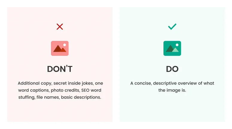
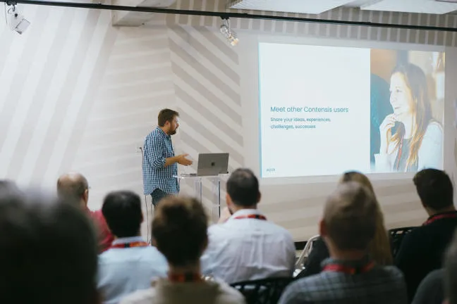
Good alt text: A male presenting to a crowd using a laptop and projector screen.
Bad alt text: Image of a man in a blue shirt, standing at a podium with his laptop, presenting to a crowd of people who are sitting down at a conference with a projector screen.
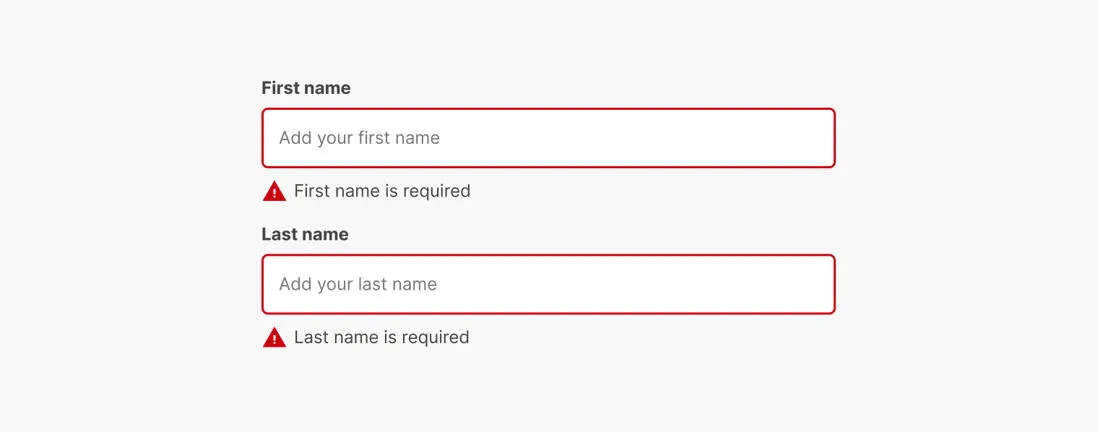
Make sure forms are accessible
If you are planning to add a PDF application form, be aware that compared to online forms, PDFs are ‘usually inaccessible, hard to use and, on average, eight’ minutes slower to process’ – a significant barrier for users.
Online forms shouldn’t be an afterthought. A user’s trust or relationship with an organisation can be influenced by their experience with them, so they should be highly-accessible, easy-to-complete, and quick to process to avoid people becoming frustrated and dropping off before finishing it.
An accessible form has a logical focus order for keyboard users; clear and concise labels (with supporting hint text to provide contextual help); and descriptive jargon-free error messages explaining what went wrong and how to correct it.
It’s worth breaking down your form by asking one question per page to avoid overwhelming those with lower confidence levels.
Error messages
Make sure that user error messages are friendly, appropriate and useful, so they can rectify it quickly. If there are errors in a form, indicate how many and list them, allowing users to click the error to take them to the appropriate field straightaway.
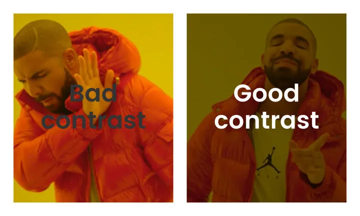
Colour contrast
As W3C points out, people who struggle with colour contrast or distinguishing between colours (‘colour blindness’) need sufficient colour contrast to read websites effectively. It requires a colour contrast of at least 4.5:1, which not only supports people with disabilities but makes websites accessible in different environments, such as bright sunlight.
Content presentation
Content should be presented in a way that is easy for people to digest. Consider whether you can break down information into bite size pieces, and how to organise it so that readers find the most relevant details quickly. Diagrams, photos and illustrations provide alternative forms of communications – but must adhere to the alt text and colour contrast standards.
Responsive layouts
Responsiveness is the minimum standard for websites today but it is also vital for accessibility. People with visual impairments, including those who use screen readers, should have a seamless experience whether they are using a mobile, tablet or desktop. A user should also be able to reasonably zoom to 400% to use a website, without horizontal scrolling.
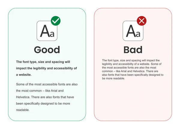
Typography
The font type, size and spacing will impact the legibility and accessibility of a website. Some of the most accessible fonts are also the most common – like Arial and Helvetica. There are also fonts that have been specifically designed to be more readable.
Chapter 6: What does good look like?
So far, we’ve given you plenty of food for thought – but what does it mean in practice? Below are examples of what good and poor web accessibility looks like.
The good
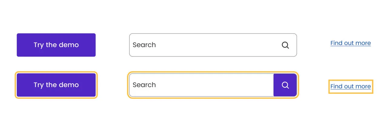
Focus states on buttons
Typography
Colour contrast
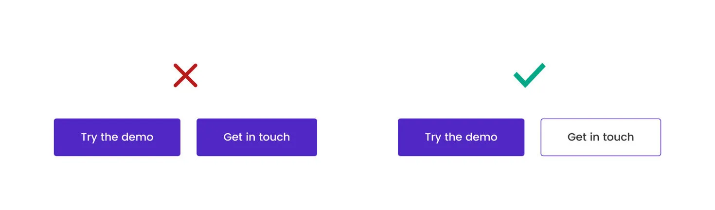
Call to action buttons.
Chapter 7: Testing and evaluating accessibility
We have seen why it’s faster and more cost-effective to ensure code meets accessibility standards right from the start of a project. The UK government recommends running regular tests as soon as developers start writing code, and then again whenever new features are introduced.
There are tools to help you understand the accessibility of your website, and highlight areas for improvement, including how to meet the needs of those using assistive technologies.
Benefits of automated testing
- Flags up issues visually so it’s easy to understand.
- Easy to use, even for those without a coding background.
- By integrating it into builds, issues are highlighted quickly.
- Saves time.
- Web services like Google Lighthouse can scan the site, offering an overall score and a clear list of improvements.
- Treejack helps you evaluate the findability and hierarchy of content on your website.
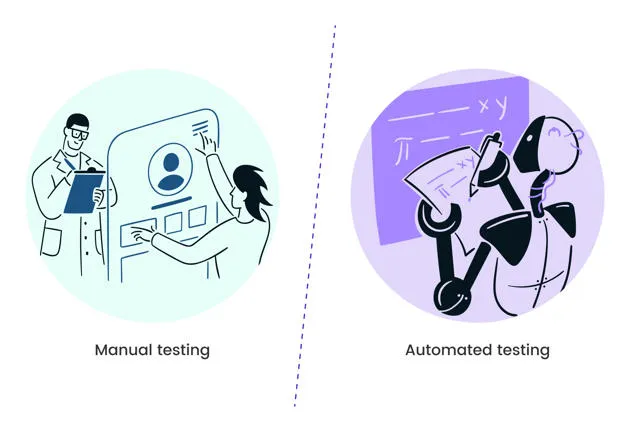
Automated testing isn’t fail-safe, though. In fact, it can only normally identify around 30% of issues, and the results may be misleading.
This is why development teams should combine it with manual testing, which could involve navigating the site without a mouse, testing using assistive technologies such as screen magnifiers or screen readers, and checking the code they write.
Real-world testing
It goes without saying that the needs of disabled people should drive website accessibility, so real-world testing is essential.
At Zengenti, we work with the Digital Accessibility Centre (DAC) to test our product, Contensis. The DAC gives people with visual impairments, cognitive difficulties and other disabilities an opportunity to try a website and provide honest feedback on what works well and what doesn’t.
About the Digital Accessibility Centre (DAC)
The Digital Accessibility Centre (DAC) works with organisations to ensure digital media is accessible to everyone, in line with accessibility standards and legislation.
The DAC offers accessibility training and consultancy to help businesses become genuinely inclusive, as well as development, testing and accreditation.
‘People with disabilities are having to choose between websites – we're choosing the ones that are more accessible.’
We caught up with Michael Taylor, senior accessibility analyst and communications and training manager at the Digital Accessibility Centre (DAC). Michael is visually impaired and tells us about how poor website accessibility can impact users – and how digital teams should respond.
Paying the price for inaccessible experiences.
Imagine being unable to find the same discounts and deals online as everyone else simply because you are unable to navigate a website.
That is the reality for many people with disabilities, including some of the two million people living with sight loss, like Michael Taylor from the DAC. Inaccessible sites force costly alternatives, hindering digital inclusion.
Recalling one such occasion, he said:
“When shopping around online for the best price for an item, I couldn’t take advantage of a deal due to an inaccessible website. The outcome was using an alternative website, and I ended up paying much more for the product.”
“People with disabilities have to choose between websites, and, of course, we choose the ones that are more accessible.”
80% of customers with access needs will spend their money not on the website that is cheapest but where faced with the least barriers.
80% of customers with access needs will spend their money not on the website that is cheapest but where faced with the least barriers.
The common barriers faced today.
Everyday tasks become daunting obstacles for those with disabilities.
Michael underscores the difficulties:
"An inaccessible CAPTCHA using images or math is a hurdle for blind, low-vision, and cognitively challenged users. Ambiguous link text like 'click here,' poor colour contrast, small text, and unreadable fonts render websites inaccessible.”
Lack of alt text for images leaves visually impaired users in the dark, while poorly designed buttons on touchscreen devices impede those with limited mobility. These challenges create unfair and discouraging barriers to completing essential tasks."
Breaking through web accessibility barriers.
Michael's journey illustrates the power of technology and human connection in overcoming barriers.
He shares, "Screen reading software, powered by technology and AI, opened doors to previously inaccessible content. Scanning printed material with a phone camera or seeking help from relatives became lifelines, although privacy concerns linger."
Innovative solutions like Aira offer real-time support for blind users, providing invaluable assistance in tasks like locating entrances.
However, accessibility disparities persist due to subscription costs and data requirements. A more inclusive alternative, Be My Eyes, connects users with volunteers, aligning with Michael's belief that a one-size-fits-all approach doesn't suffice.
His experiences underscore the imperative for businesses to cater to diverse needs, offering contact options like forms, email, and phone support to ensure inclusivity.
Collaboration is key to future success.
Michael says: “It’s important to find solutions that work for everyone. Collaboration with disability groups, rigorous testing, and feedback should be standard so web designers get a first-hand account of the challenges we face and can help us overcome them.”
Collaboration stands as the cornerstone of progress. To test and enhance websites effectively, engagement with a diverse range of people with disabilities is imperative. Without robust testing, websites risk excluding essential user groups.
Each individual has unique methods of navigating the digital landscape and using assistive technology. Therefore, gathering a wide spectrum of perspectives and feedback is crucial. As Michael emphasizes, some users may have specific device or operating system preferences, while others might not even be aware of available assistive technology. Moreover, affordability and accessibility concerns further underscore the importance of consulting with various user groups to ensure a truly inclusive and functional website.
Chapter 8: Embracing an inclusive mindset
Accessibility, as we have seen, shouldn’t be an add-on at the end of a project or something that is continually deprioritised until it is neglected completely.
It is at the core of every web development project, and those who get it right can expect to save time and engage users in a way that drives sales and loyalty, and enhances reputations. Organisations that have invested in accessibility can often unlock wider benefits, too, like improved search engine performance.
Zengenti, the creator of Contensis, has been developing its content management system (CMS) for well over 20 years. It has been built in a way that promotes good practice among content creators – for example, limiting characters in titles to improve readability as well as promoting the use of alt text for images.
Alongside this, our Insytful tool helps you to check both the data and content of your website to deliver inclusive experiences for everyone.
The team has worked extensively in the public sector, helping organisations meet their legal obligations requirements, and is now working increasingly in the private sector, helping businesses to create accessible websites in the most efficient way possible.
Working with organisations like DAC has given us first-hand insight into the challenges a growing proportion of the population faces and incentivises us to design solutions.
A website is the digital shop window for many businesses today and the first interaction many people have with their brand. It, therefore, has to be welcoming and inclusive if it is to serve as many people as possible.
Accessibility isn’t confined to a select few people in web development, design and content teams but is something that drives decisions across the business and is embedded in its culture.
Find out how Contensis can help you build an accessible website.
Chapter 9: Resources and further reading
Read
- Website - The A11Y Project is a community-driven effort to make digital accessibility easier. It provides a handy checklist based on WCAG principles.
- Book - Accessibility for Everyone by Laura Kalbag.
- Website - Resources and tips from Microsoft on Inclusive Design.
- Website - AbilityNet, a UK charity which works with organisations to develop accessible products and services.
- Website - WebAim provides training and resources on accessibility.
- Website -The UK government’s guide to understanding WCAG 2.1.
- Website - Liam O’Dell advises organisations a range of matters, including website accessibility.
Watch
- Make your site more accessible - an introduction to WCAG 2.1 | Webinar on demand.
- Accessibility basics - an introduction to ARIA | Webinar on demand.
- Making Contensis more accessible | Webinar on demand.
- Accessibility in practice - the card component | Webinar on demand.
