Creating consistent user experiences with a composable design system


In our last post, we looked at the difference between composable architecture and front-end composability, and why you need both working together to build a truly flexible, future-proof digital estate.
Most of the time, composability conversations centre around back-end choices: headless CMS platforms, APIs, best-of-breed integrations. But it’s your front end that shapes how people actually experience your brand. That needs to be composable too.
A composable front end, powered by a structured design system, gives you the tools to create consistent, scalable user experiences – no matter how many sites, services or campaigns you’re managing.
In this article, we’ll look at what makes a design system composable, why it matters for user experience, and how you can start putting it into practice.
In this article:
What is a design system?
You can think of a design system as an agreed set of rules and reusable building blocks for how your website or digital services look and work.
It covers everything from your colours, logos and typography to how buttons, forms, and menus behave. It also includes accessibility guidelines and patterns for things like error messages or mobile navigation.
Instead of each team or project creating their own interpretations of your brand or inventing new components every time, a design system provides a single source of truth. It means whoever builds a page or service – whether it’s your main marketing site, a student portal, or a local planning application form – it uses the same toolkit, so everything feels consistent, on-brand, and easy to use.
For example, a university might have a design system that defines how course listings, staff profiles, and research highlights all appear, including shared layouts, image treatments, and call-to-action buttons. A local council might have one that standardises how service information and application forms are presented, so residents have a familiar experience no matter what they’re trying to do.
At its core, a design system helps large organisations deliver a joined-up experience across multiple sites, departments and services – and makes it easier for teams to build new pages without starting from scratch.
What makes a design system “composable”?
A design system becomes composable when it’s set up so teams can easily reuse and combine its parts in different ways across different sites, pages or services – without breaking consistency or accessibility.
It’s not just about having a library of styles or standalone components. A truly composable design system is:
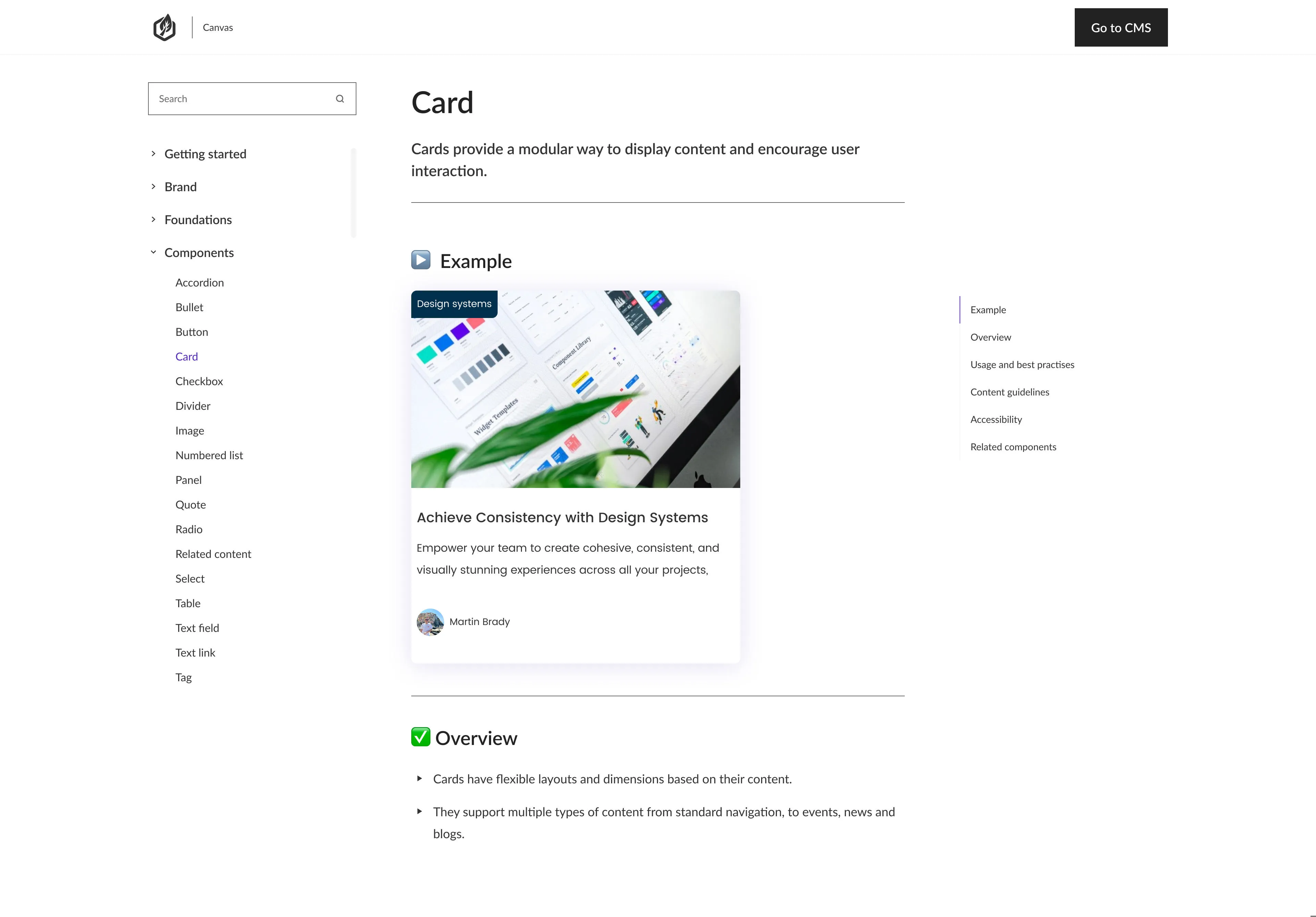
- Modular and reusable – each part fits into new layouts or contexts without needing to be redesigned. Many teams use principles from atomic design here, starting with small building blocks like buttons and inputs, combining them into larger patterns like form groups or card layouts, and then into full page sections.
- Structured for flexibility – so teams can build pages and campaigns for different audiences or goals without starting from scratch.
- Consistent by design – using shared styles and patterns, so everything feels joined up, whoever builds it.
Think of it like a library of recipes built from your core brand ingredients. Your colours, typography, and imagery are the pantry. The design system defines how they come together in repeatable recipes – like cards, banners, or forms – so different teams can create what they need, and it still all feels unmistakably yours.
Why does this matter for UX?
Inconsistent front ends aren’t just a design issue – they directly affect how people use and trust your services.
When there’s no shared approach to building pages, different teams naturally develop their own layouts, navigation patterns, or design shortcuts. These differences often start small: a slightly different button here, an alternative layout there. But over time, they add up to a fragmented user experience that feels disconnected and confusing.
This kind of inconsistency creates friction. Users have to re-learn how to navigate each part of your site. That erodes trust and can lead to drop-off, support calls, or poor feedback – especially for critical services.
It also creates real problems for internal teams:
- Delivery slows down because every new page or campaign becomes a mini design project, with developers and designers reinventing patterns instead of reusing proven components.
- Accessibility is harder to guarantee because when new components are built in isolation, accessibility rules can be missed, creating inconsistent experiences for users who rely on assistive tech.
- Brand voice and tone drift as teams interpret guidelines differently – or make choices based on what’s available rather than what’s right.
A composable design system gives you a reliable foundation to avoid these issues. It lets you scale consistently – across departments, sites and campaigns – while giving teams the tools they need to move quickly and stay aligned.
How to create a composable front end with a design system
A composable design system isn’t just a set of brand guidelines or Figma files. To truly work at scale, it needs to be implemented as front-end components – reusable chunks of code that bring your design system to life in the browser.
Each component – whether it’s a card, a hero banner, a table, or a multi-step form – encapsulates your styles, interactions and accessibility rules. It means developers and content teams aren’t constantly restyling elements or rebuilding functionality from scratch. They use pre-approved building blocks that guarantee consistency, speed and quality.
That’s what allows your design system to become composable. It ensures different teams can build new pages, services or campaigns by assembling these front-end components in whatever combination they need without breaking the overall experience.
Here’s how to start making that a reality, with some of the practical steps and questions we often see organisations tackle.
1. Audit what you have
Start by taking a hard look at your existing sites, services and digital products.
- Are buttons, headings and CTAs consistent from one page to the next?
- Do different departments have their own approaches to layouts, spacing or interaction patterns? Are teams using different solutions for the same problems?
- Are there fragments of older branding still showing up?
2. Build (or improve) your design system with real use cases in mind
It’s easy to think of a design system as just a neat pattern library or a set of Figma files. But for it to be genuinely useful, it needs to be shaped by your actual use cases.
Think about the kinds of pages or services your organisation builds most often – like course listings, staff directories, event calendars, or online service application forms. Then look at the components that keep cropping up across them, whether that’s cards, tables, step indicators, or call-to-action banners.
Once you know what’s needed, build (or refine) your design system to cover these essentials:
- Design tokens: shared values for colours, typography, spacing and more. These make it easy to apply consistent theming across different sites or brands by simply switching a set of tokens.
- Reusable components: like cards, forms, tables, banners and buttons, all designed to slot into different contexts. Structuring them around atomic design principles makes this easier – starting with simple “atoms” like buttons and inputs before combining them into more complex components and full sections.
- Interaction patterns: rules for things like how modals open, how errors show, and how navigation menus behave.
- Clear documentation: so everyone knows when and how to use each element, and what the accessibility considerations are.
By grounding your design system in the real work your organisation does every day – and structuring it with tokens and atomic design principles – you make sure it’s something teams actually want to use, not just a theoretical exercise.
3. Structure your content to support your components
Even the best front-end system breaks down if your content isn’t structured to fit.
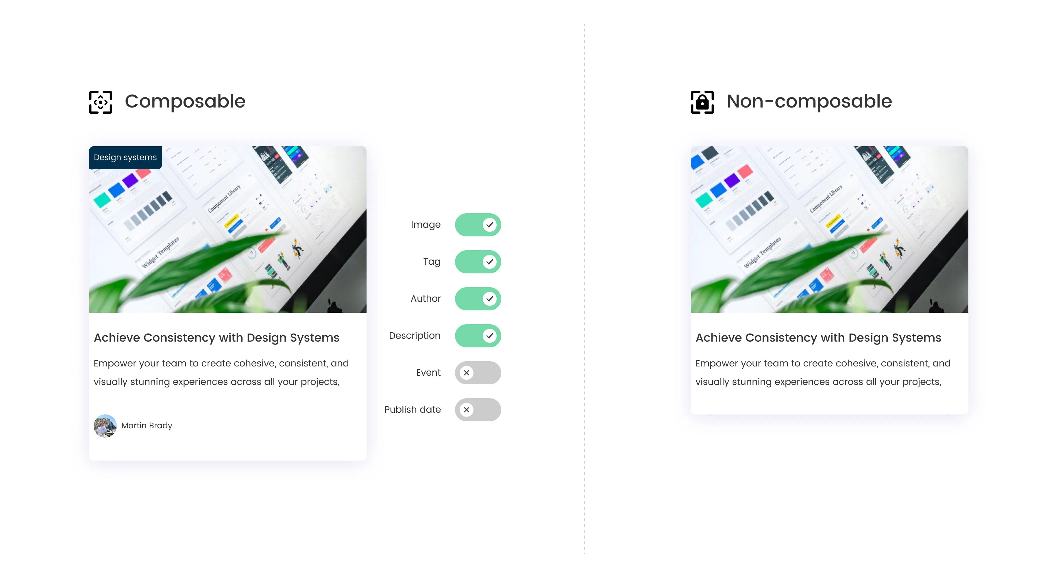
If your CMS still relies on large rich text fields that mix copy, links, images and embedded styling, your content is tied to one presentation. It’s hard to reuse elsewhere – whether that’s in a different component on the same site, across a microsite, or in an app or newsletter.
A composable front end needs your content to be broken into clear, predictable fields that map directly to your design system’s components. This isn’t just a technical preference – it’s what allows teams to build new layouts, repurpose content across channels, and stay consistent without needing developers to hard-code layouts every time.
How to approach it:
- Define clear content types (such as events, staff profiles, course listings) with fields that map directly to your components.
- Keep each field focused on a single piece of content. For instance:
- Event: title, date, time, location, description, related downloads.
- Testimonial: quote, name, role, image.
- Service page: summary, detailed steps, contact info, opening hours.
- Ensure your CMS delivers this via APIs so your front end can pull in just what it needs.
4. Set clear governance and workflows
A composable system can still unravel if you don’t have the right rules, roles and checks in place. Without clear governance, even the best design system can drift – as different teams adapt components or build their own variations over time.
Start by deciding who owns the system. Is it your central digital team? Brand and UX? A joint steering group? Make sure ownership is clear, so someone’s responsible for keeping everything aligned and up to date.
Then work out how new components or patterns get proposed, reviewed and added. Without this, you’ll end up with ad hoc one-offs that dilute consistency and add to long-term maintenance. Make sure everyone knows how to propose changes, who approves them, and how updates get rolled out.
Practical ideas:
- Document simple ground rules. For example:
- “All new components must be reviewed by brand and UX before being added to the library.”
- “Updates to shared styles must include an accessibility check.”
- Use your CMS’s workflows to back this up. Restrict who can publish layouts or components, or set approval steps for changes to core structures.
- Hold regular reviews to see what’s being built. This helps catch duplicate or inconsistent patterns early.
5. Make it easy for teams to use
Even the best design system and governance rules will fail if it’s harder to use than to bypass. Teams under pressure to launch a campaign or get a service live won’t wait for approvals or hunt for the right component if it slows them down.
Here’s how to make your system the path of least resistance:
- Keep examples up to date in tools like Storybook or Zeroheight so everyone can see exactly how components should look and behave, with usage do’s and don’ts.
- Consider offering a library of well-documented components that developers can pull straight into new builds. This could be a Storybook instance, a component repo, or live examples tied to your design system guidelines.
- Provide ready-to-use content models in your CMS for common use cases. If content teams know exactly what fields to fill out for a staff profile, event, or programme page, they’re far less likely to invent something new or misuse a generic rich text block.
- Share clear examples of how content types map to components, including sample API payloads, so developers and designers can quickly see how to wire things up.
- Offer quick induction sessions for new team members, plus regular refreshers for existing teams. Short drop-ins or recorded demos often work better than heavy documentation alone. Consider running regular “show and tells” where teams share what they’ve built. It highlights smart uses of your system, spreads ideas, and quietly flags misuse or gaps in guidance.
Keep listening too. If teams are constantly asking for slight tweaks to components or requesting similar variations, it’s often a sign your design system needs to adapt – not that people are failing to follow the rules. When it’s genuinely easier and faster to build inside your system than outside it, composability stops being an aspiration and becomes the default.
The role of your CMS and platform
A composable design system isn’t just about Figma files, Storybook or front-end frameworks. Your CMS has to support this way of working too.
It’s your CMS that delivers structured content in clean, predictable formats that your components can consume. It’s also where governance happens – where workflows ensure only approved content models and layouts go live, and where roles and permissions keep the whole system aligned.
If your CMS still relies on rigid page templates, it’ll be hard to adapt to new channels or content needs. But if it’s too unstructured – where anyone can build layouts however they like – it’s almost impossible to maintain consistency. You need a system that strikes the right balance: giving teams the freedom to assemble content and components in new ways, while still enforcing shared standards.
This is one of the reasons Contensis has evolved from a headless CMS into a composable DXP. It gives you:
- Structured content models that separate content from presentation
- APIs and webhooks that deliver content exactly how your front end needs it
- Flexible layouts tied to reusable components, not rigid page templates
- Editorial workflows and roles that protect your design system’s integrity
- The ability for teams to preview exactly how content and components will appear before publishing – so they can move quickly with confidence
It means you can build a composable front end on top of a platform that’s already designed to support this approach, without having to bolt everything together yourself.
Composability doesn’t limit creativity – it frees it
A composable design system doesn’t put your brand in a box. It gives your teams the confidence to move faster, try new ideas, and reach different audiences – all while keeping the experience consistent, accessible and on-brand.
In our next post, we’ll look at how Contensis helps you put all of this into practice, with tools to build, govern and evolve a composable front end that works for your users and your organisation.