

Content type picker
Log in to add to favouritesPage last updated 17 August 2026
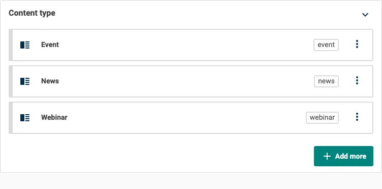
Use the Content type picker to select one or more content types from your project. Add it when an entry or component needs to reference content models instead of individual entries, such as for a filter, listing, or dynamic component.
To add this editor, select Resource picker from the content type builder toolbox, then select Content type from the Select a resource type window.
The Content type picker is available on entry and component content types.
Appearance
Settings
| Setting name | Summary |
|---|---|
| Name | A text label to identify the field in an entry. |
| Field ID | A sanitised name to be used by the API. |
| Multiple selection | Allows you to select more than one content type. |
| Read only | Prevents authors from editing the field in the entry editor. |
Supported validation
This field editor supports the following validation methods:
- Required field, for single selection
- Item count, for multiple selection
Properties
Common properties
| Property name | Summary |
|---|---|
| Field visibility | Determines if the field is shown collapsed when the entry editor loads. |
Allowed content types
Use the Allowed content types property to restrict which content types you can choose. By default, all entry content types in the project are available. Use the search box to add content types to the allowed list.
Component button label
For multiple selection, use the Component button label property to change the button used to add another content type. If you do not set a label, the button displays Add more after you make a selection.