Build better web forms: 15 UX guidelines that work

Whether you’re signing in to an account, subscribing to a newsletter, making a purchase, or submitting a service request—web forms are the backbone of digital interaction. They’re often the main way users provide information, complete tasks, or begin a relationship with a service or organisation.
Good form design affects how quickly, accurately, and confidently someone can complete a form. If the process is slow or confusing, users may abandon it entirely—whether they’re applying for a course, reporting a missed bin collection, or requesting a product demo.
When forms follow usability best practices, they’re faster to complete, easier to get right first time, and more likely to be submitted. That helps both users and your organisation meet their goals.
15 best practice principles for web forms
The best form design depends on several factors: how long the form is, what it’s for, what type of data you need, and how that data will be used. Before starting, be clear about what information is required and how it should be structured.
For example:
- A university might want to increase international student applications through a simplified multi-step form.
- A council might reduce contact centre calls by improving online service request forms.
- An enterprise organisation might capture more leads or accelerate HR processes with forms that validate input in real time.
The 15 principles below provide clear, practical guidance for building forms that help users complete tasks efficiently—and help organisations get better results.
1. Clear, accessible, short labels
Use concise labels that describe exactly what’s required. Place labels above fields on mobile and short forms, or beside fields on longer forms. Use tooltips or helper text for extra context.
Example: In Contensis Forms Builder, you can add a field labelled “Full name” with a tooltip that says, “Please enter your full legal name”.
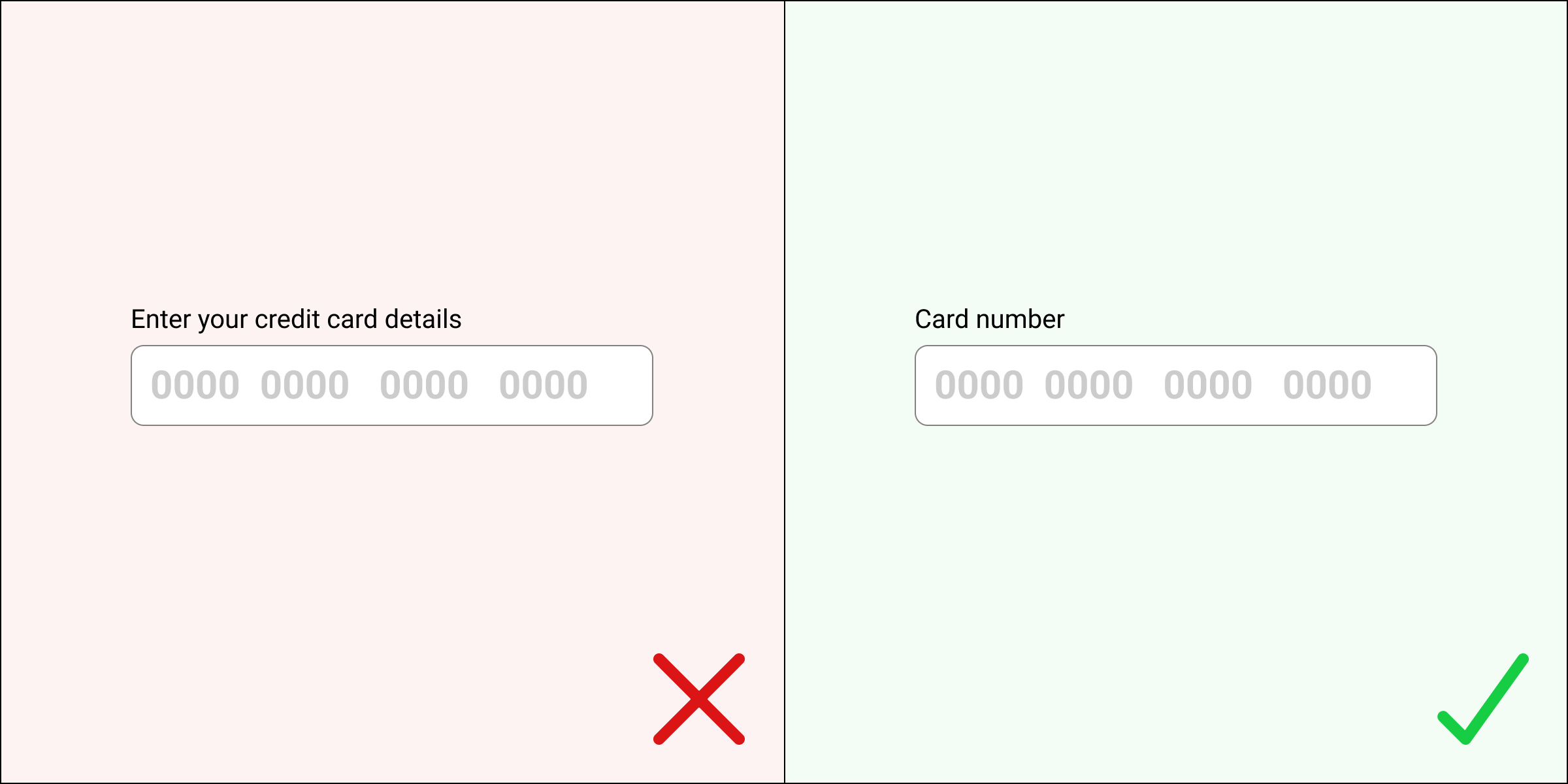
2. Field length and format should match expected input
A field’s size and format should hint at the type of input—e.g. a short field for a postcode or card CVV, a larger one for a message.
3. Use multi-page forms for complex tasks
Break longer forms into clear steps. Show progress to reduce overwhelm and help users stay engaged.
Example: A course application form might follow steps like: Personal details > Course selection > Payment. In Contensis, these can be created using the multi-page form option with visual progress indicators.
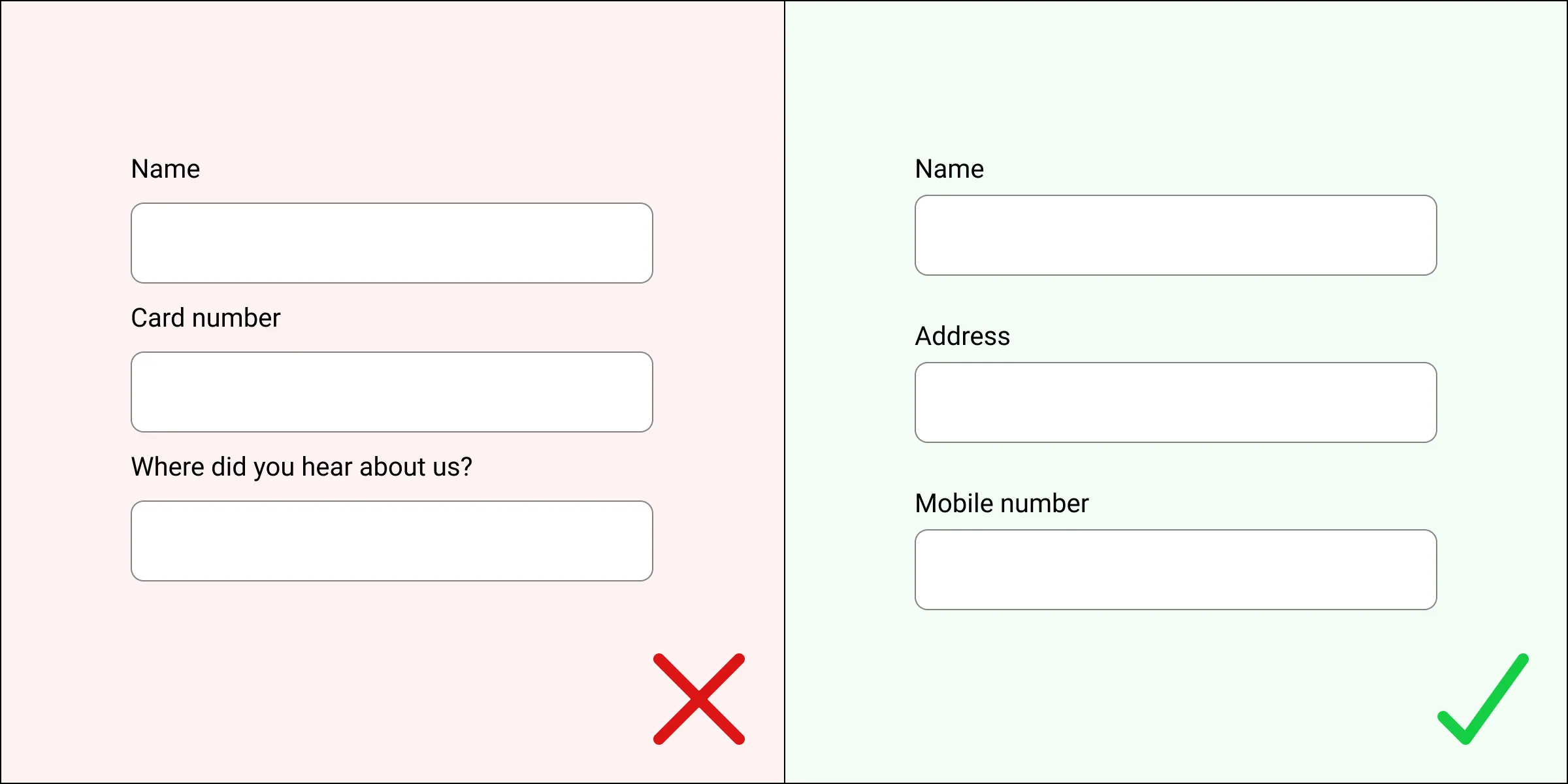
4. Group fields logically
Put related fields together. For instance, name, email and phone should be grouped under ‘Contact details’. Keep labels close to their fields to maintain clarity.
5. Set expectations early
Let users know what they’ll need (e.g. passport or payment details), how long it might take, and what happens after submission.
6. Minimise the number of fields
Only ask for what’s necessary. Combining or removing non-essential fields can improve completion rates—especially on mobile.
7. Explain input formats clearly
If specific formatting is needed—such as date, phone number, or password rules—show this up front, not just after an error.
Example: In Contensis, you can set validation rules for fields like emails, with real-time error messages such as “Enter a valid university email address”.
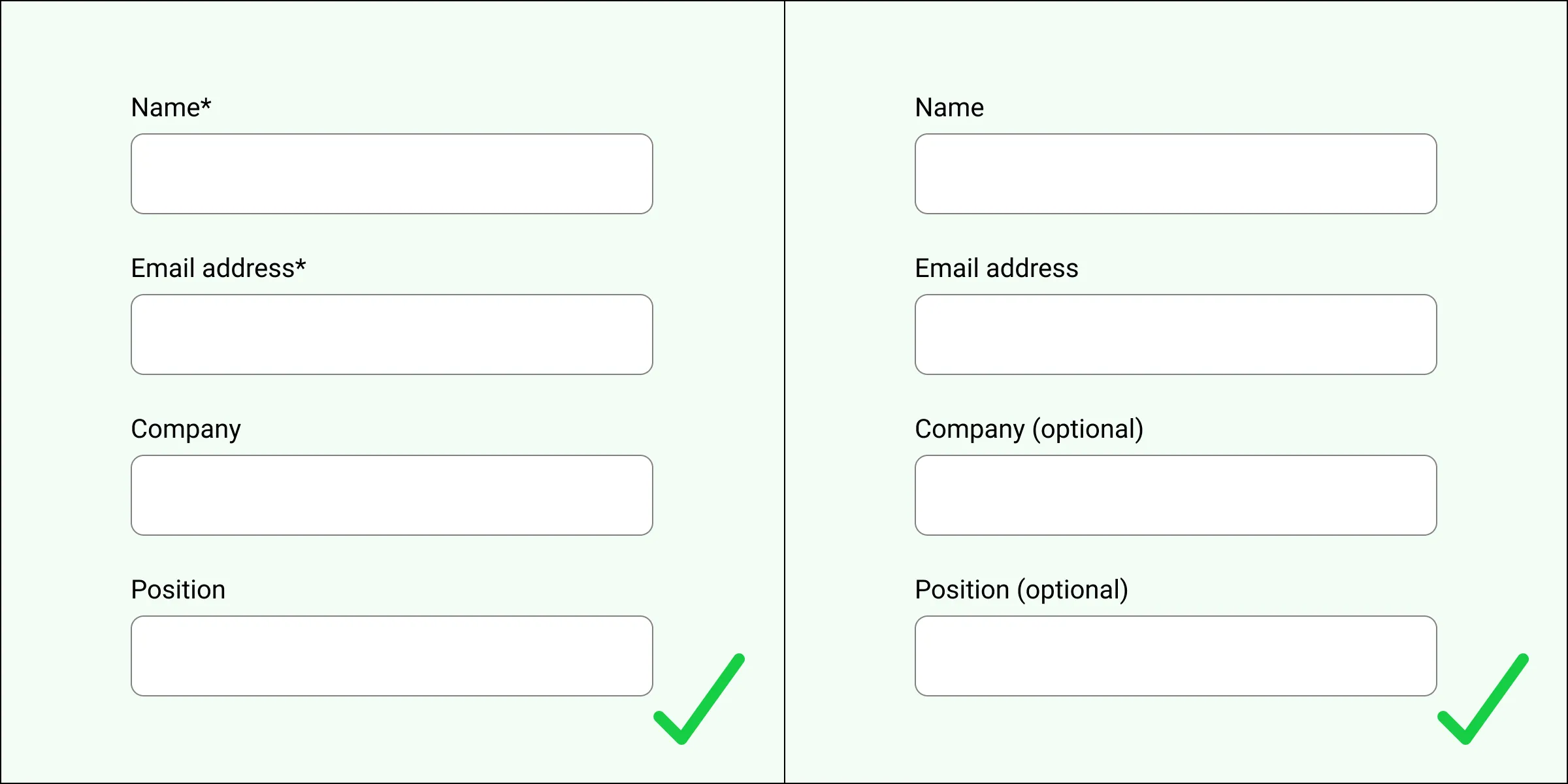
8. Make required vs optional fields clear
Use an asterisk or the word “(optional)” consistently. Never assume users will know what’s required without a prompt.
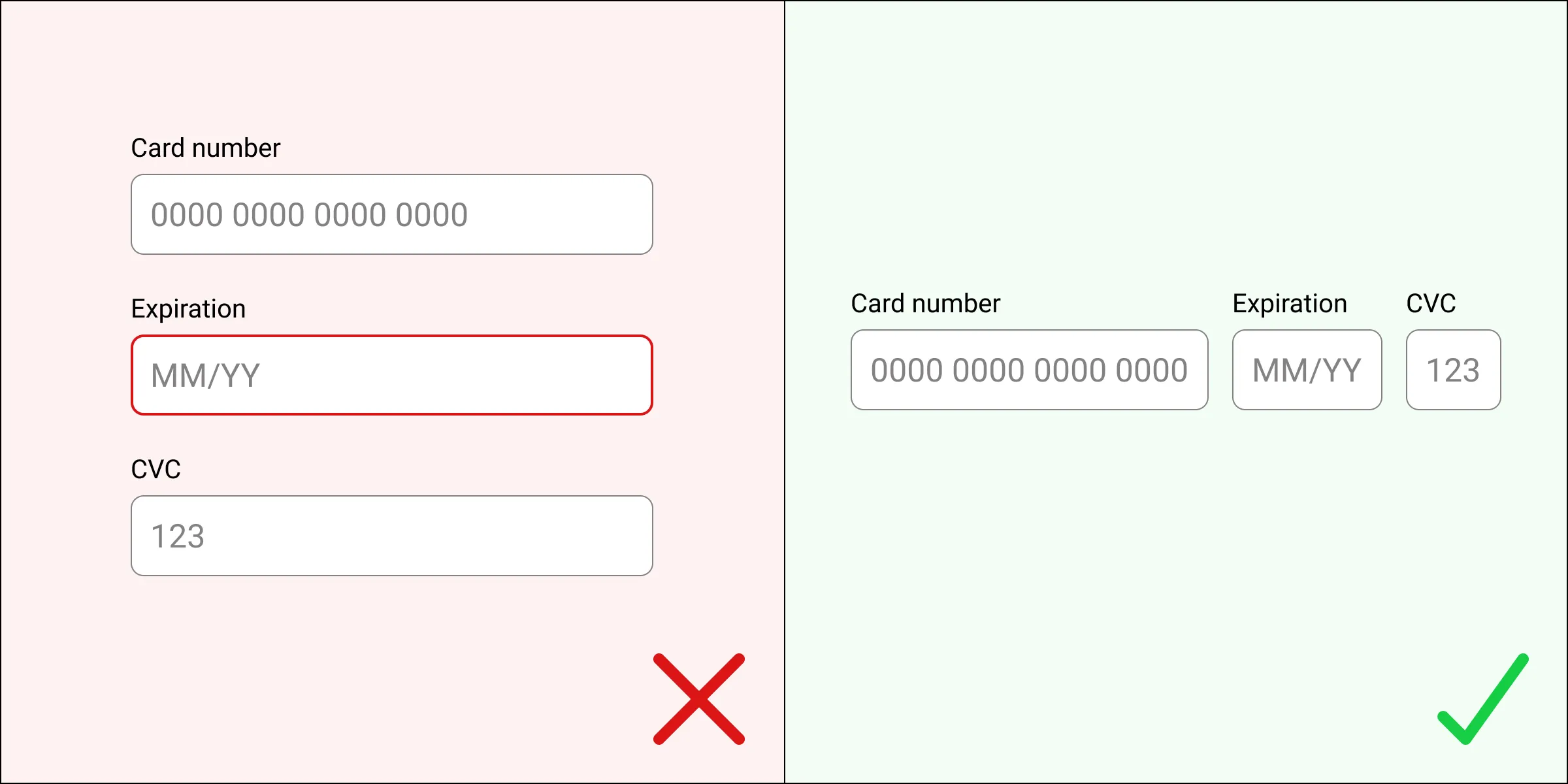
9. Use a single-column layout
One column helps users focus and avoids missed fields. It also works better on mobile and improves scanning.
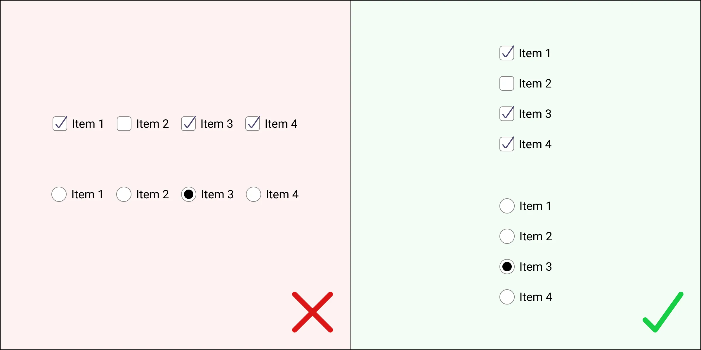
10. Position checkboxes and radio buttons vertically
Use radio buttons for single-choice questions, checkboxes for multiple selections, and keep them in a vertical stack for readability.
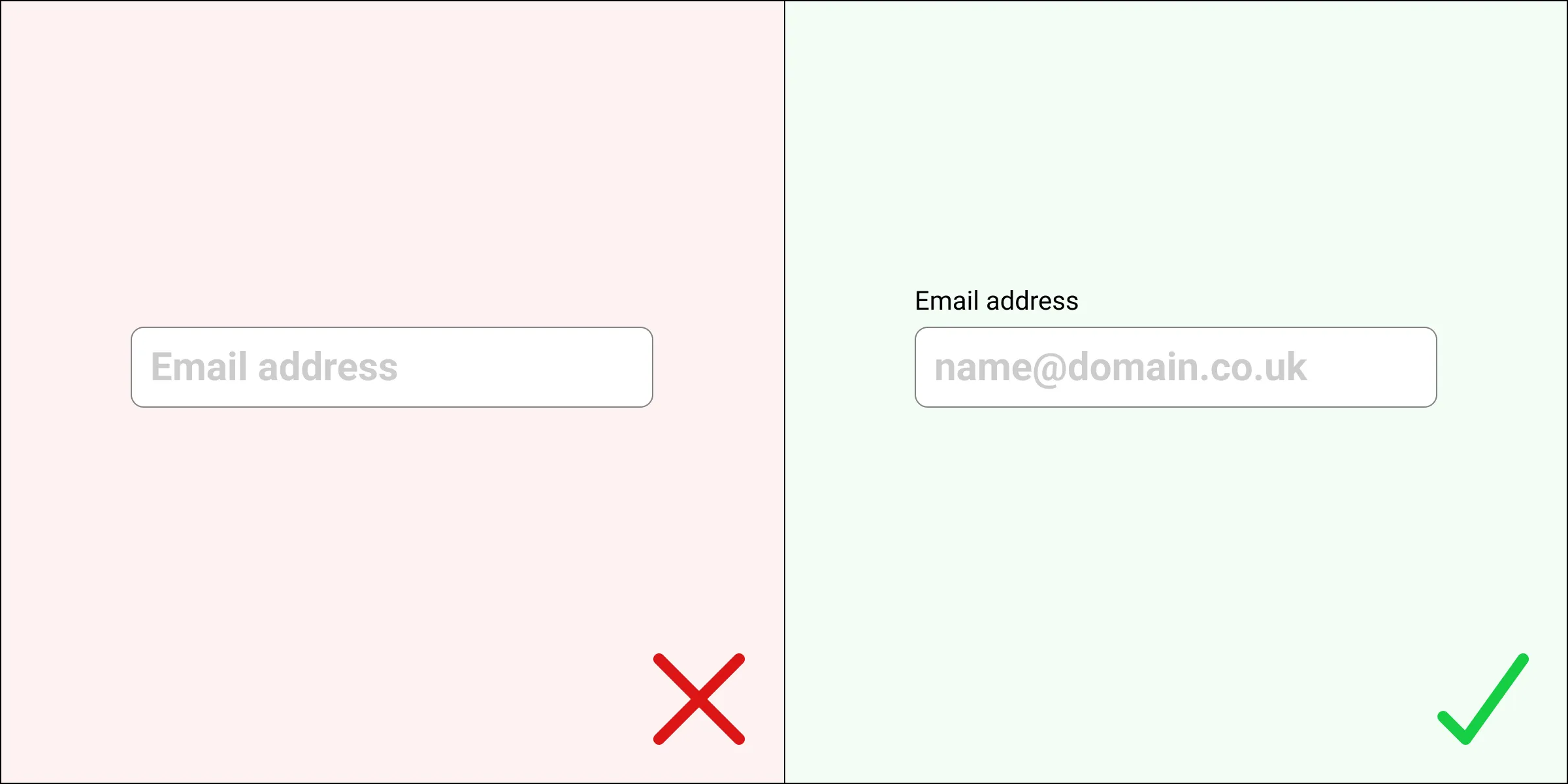
11. Don’t use placeholder text as labels
Placeholder text disappears when typing, which makes users forget what they were meant to input. Always use visible labels and keep placeholders for extra hints only.
12. Use descriptive, action-based buttons
Buttons should say what they do: Submit, Sign up, Book a visit. Avoid vague labels like “Click here”.
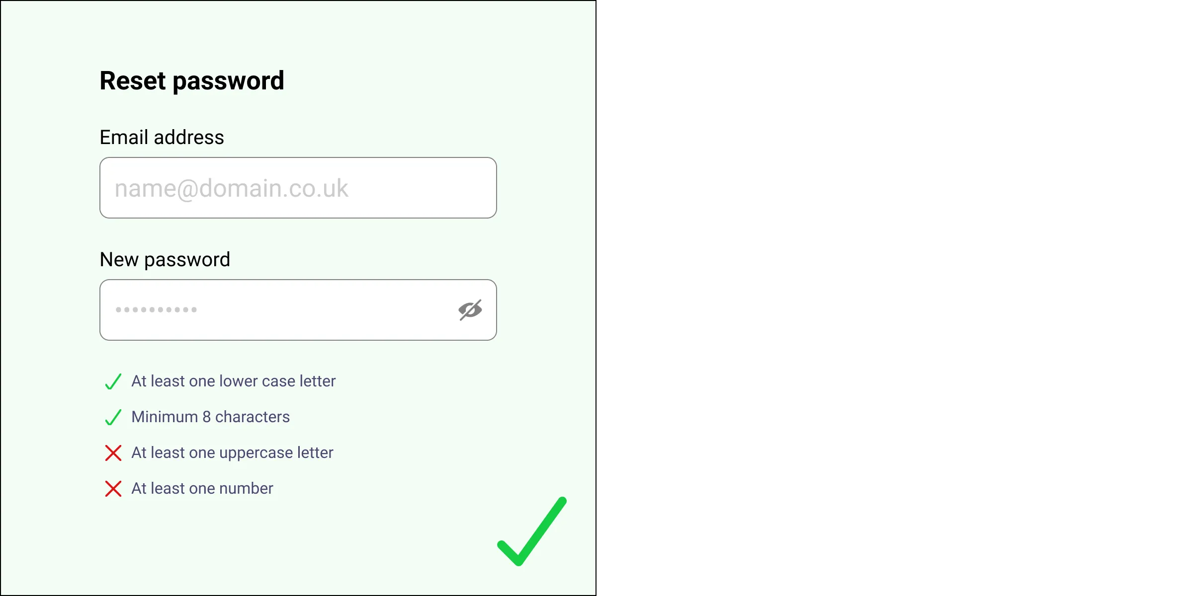
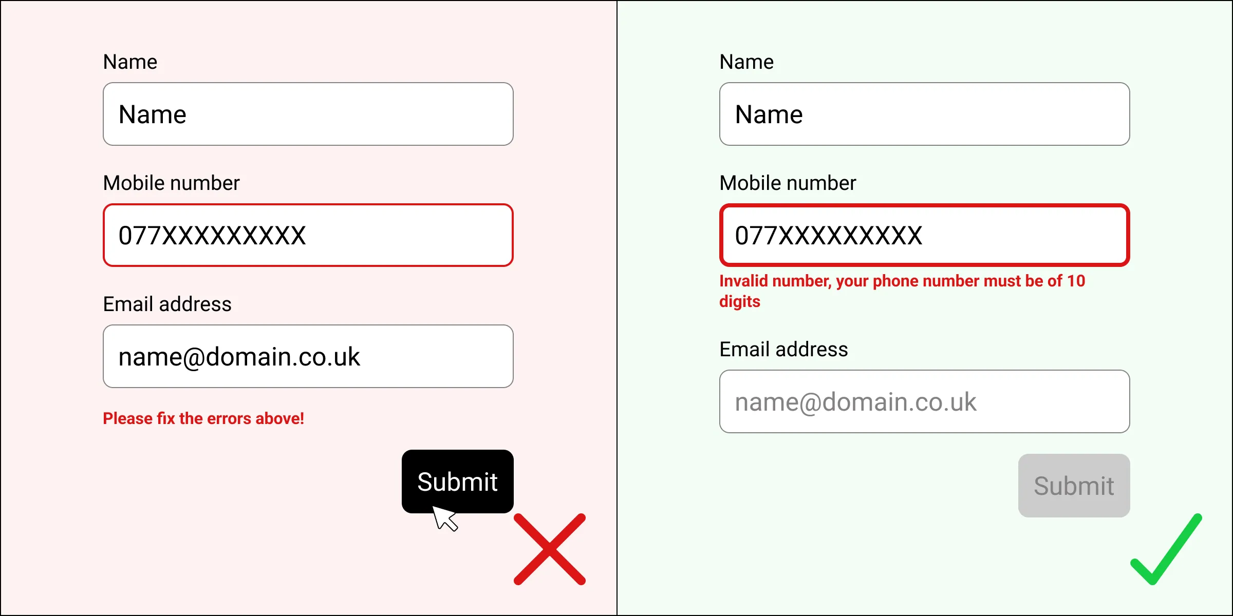
13. Use real-time validation
Show users straight away if a field is incorrect—such as a wrongly formatted date or missing postcode—so they can fix it immediately.
Inline validation, either by highlighting the input box or with a tick icon appearing next to the field, confirms that the user is making progress without errors.
14. Display errors inline
When something goes wrong, show the error near the problem field using red outlines and helpful text. Avoid error summaries that appear only at the top.
15. Always show a success message
After submission, confirm that the form went through and tell users what happens next—for example, “You’ll receive a confirmation email shortly”.

Build smarter forms with Contensis
The Contensis Forms Builder gives your team the tools to create structured, flexible forms that support everything from course applications and event bookings to internal approvals and service requests.
Forms can be fully integrated with your content model and styled to match your public site. Depending on your licence, some design work may require developer input—but once set up, your forms are reusable, easy to update, and capable of handling even complex workflows.
Want to see what’s possible? Get in touch for a demo or explore how Contensis Forms could help you simplify form management and improve user experience.
Conclusion and next steps
Well-designed forms are essential to the success of your digital services. They shape how users engage with your organisation—whether they’re applying, signing up, reporting, or giving feedback.
By following these 15 principles, you can build forms that are clearer, faster to complete, and more effective at meeting both user and business goals:
- Use clear, concise labels
- Match field size and format to input type
- Break up long forms into logical steps
- Group related fields together
- Set expectations up front
- Keep fields to a minimum
- Explain input and formatting rules
- Make required vs optional fields obvious
- Stick to a single-column layout
- Stack radio buttons and checkboxes vertically
- Avoid using placeholder text as the only label
- Use clear, action-based button labels
- Validate inputs as users type
- Show errors inline and clearly
- Confirm submission with a clear success message
For more detail on accessibility and implementation, see the W3C Forms tutorial.


