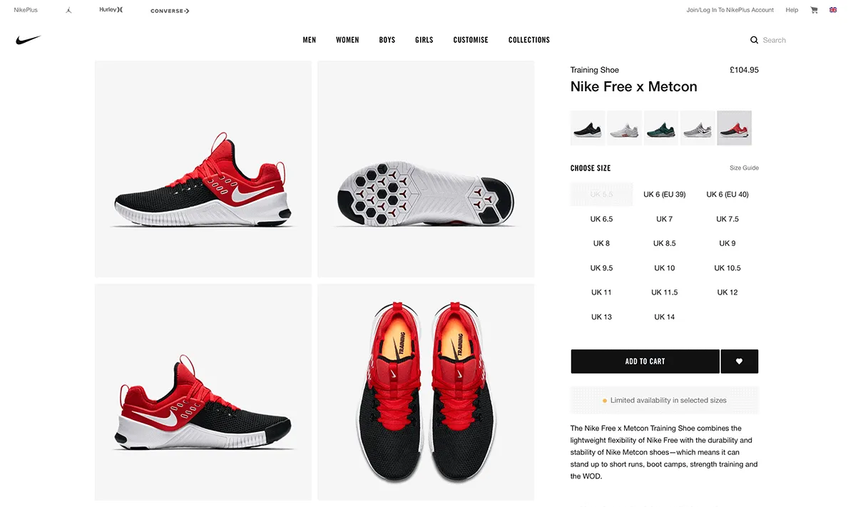
User experience lessons you can learn from e-commerce giants

Modern retail is a brutal industry. Many older companies are struggling to adapt to the changing shopping habits of consumers who now prefer to buy online. It seems a major high-street retailer falls by the wayside almost monthly. Meanwhile e-commerce is booming, with online shopping growing by almost 12% between April 2017 and April 2018.
But even the most successful e-commerce companies – whether they're start-ups or brick-and-mortar retailers that have moved online – don't rest on their laurels. They constantly improve their platforms to stay one step ahead of the competition and ensure their own survival. Companies like Argos, Asos, Made, and Next squeeze every last bit of efficiency from their websites, improving their user experience (UX) to increase conversions and boost their profit margins.
Sometimes even tiny changes lead to a massive increase in profit. There can't be many web designers who haven't listened with envy to the story of the company that increased their revenue by $300 million simply by adding a button. While that might be an extreme example, experts estimate that every $1 spent on UX results in a $100 return.
So, whether you want to make or save money, improving your UX is a pretty safe investment.
E-commerce giants like Amazon and eBay have put in the hard miles testing and experimenting to find out how people prefer to use websites. By learning from what they do – and following well-established UX best practice – you can cut out the trial and error and make your investment in UX go even further.
Here are some of the most common problem areas and how to improve them.
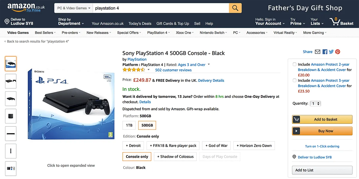
Make content easy to find
Content is only useful if people can find it. Visitors shouldn't have to waste time hunting for the content they need on your site. The chances are they won’t anyway – they’ll leave. So, you need to make it as easy as possible for users to find as soon as they land on your site.
Users don’t always arrive at your home page. They may land on another page from a Google search, by following a link from one of your marketing campaigns, or from another site. Despite your great SEO work or finely-tuned marketing messaging, some users might not find exactly what they are looking for. So, you also need to make sure they can navigate to the content they are looking for from anywhere on your site.
There are two main ways that users find content – through navigation and by searching.
Navigation
Navigation encompasses all the ways users can move between web pages. It can include menus, buttons, inline links in text, and increasingly, cards. It’s what makes the web so powerful.
If you want these users to stay on your site rather than push up your bounce rate, it’s essential that they can easily get to the content they need from whatever page they land on. That’s where well-designed global navigation – the navigation that appears on every page on your website – is invaluable.
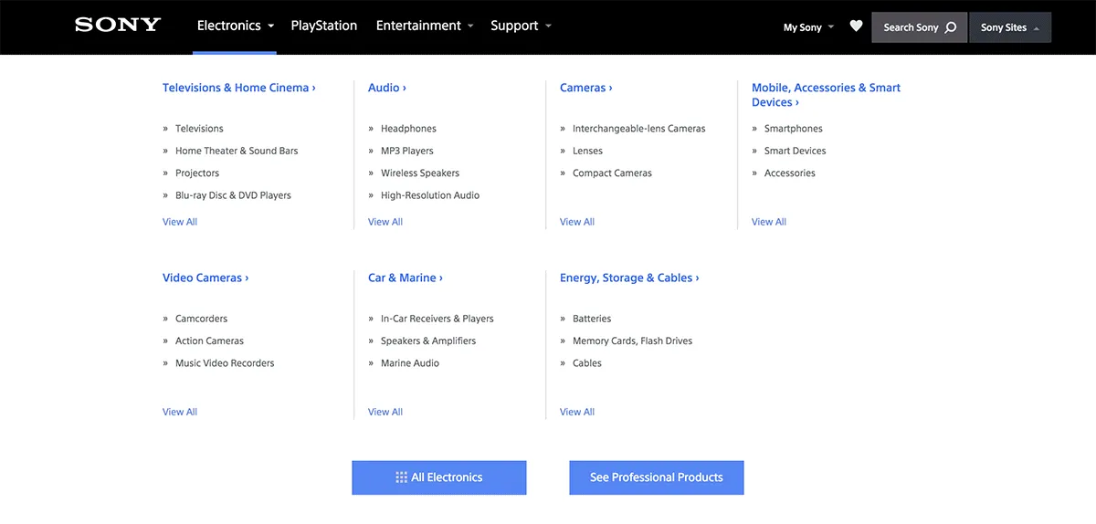
Global navigation should be:
- Obvious – put your menus where users expect to find them. This is usually along the top of the page or down the left hand side.
- Visible – don't hide menus when you have plenty of space to display them. Hamburger menus are great for saving space on a small mobile screen, but use the extra space on a desktop to make content more visible and navigation easier.
- User-friendly – use dropdown menus carefully. While they are familiar to users, they can be frustrating to navigate if they open when you hover over them. Make any drop down menus open and close with a click.
- Understandable – give your menu items labels that reflect the language of your users. This makes it easier for them to find the content that will help them complete their task. Don’t fall into the trap of using organisation jargon.
- Consistent – add your top-level navigation to every page. Users often arrive through search engines. They might decide they are on the wrong page or want to explore the rest of your site. At the very least make sure users can return to the homepage from any page on your site.
Don’t forget to test your navigation with real users. There are some great tools online for doing this. We use Treejack to test a site’s information architecture and menu structure. It allows you to create a simplified version of your menu free of any visual distractions. You can then give users tasks to complete – usually finding a item of content in the menu – and Treejack records the results.
Search
Some users prefer to search for content rather than find it in menus – especially on websites with a lot of content or subsections. Unfortunately, most people aren’t very good at searching. So, it’s crucial that your search works just as smoothly as your navigation.
Prioritise relevant content
Set up your search engine to make sure the most useful content is always returned for common queries. Look through your site’s search logs or use the site search report in Google Analytics to find the content that users search for most often. Check if your search engine allows you to score or weight certain items to make sure they appear above less relevant content.
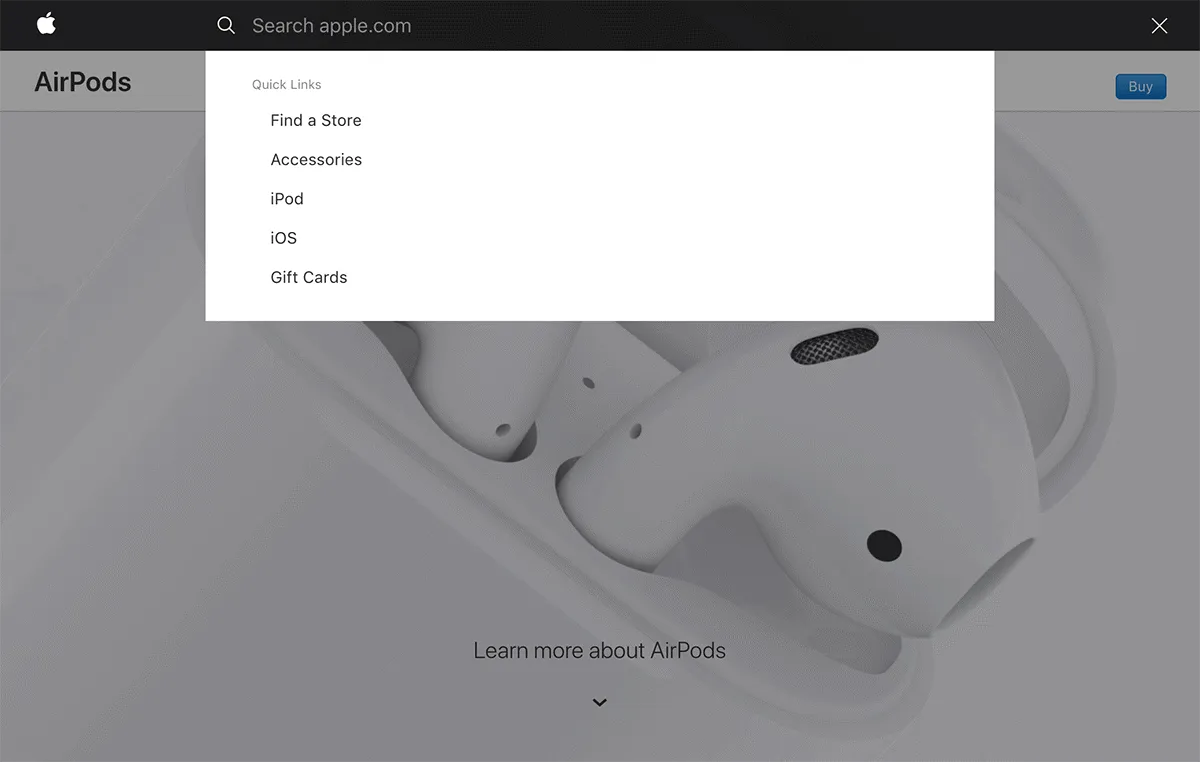
Make the search box easy to find
Put the search box in the top centre or top right corner of the page – that’s where users expect to find it. Make sure it’s obviously a search box. It’s okay to use a magnifying glass icon to call attention to it, but don’t hide the text field behind the icon.
Cut down on the amount of typing users have to do
Use auto-complete to complete search queries as users type. This helps with information scent – it lets users know they are on the right track. Plus, it saves mobile users from having to type queries out in full on small keyboards.
Give users the chance to refine their query before they search
Provide auto-suggest functionality to display possible results as users type. This removes friction from the search process because users have the chance to refine their query before they search. Consider redirecting clear and unambiguous searches – such as “courses” – straight to a category page, as in the CostCo example in this article by Nielsen Norman Group.
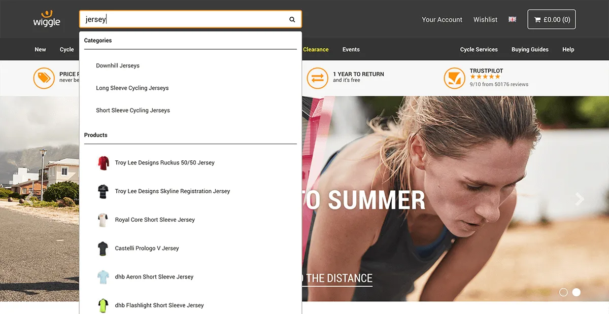
Don’t erase users’ search terms when they submit their query
Users will often refine their search by making changes to their original query. Erasing their last search term makes this harder. Instead, make sure a user’s last search term remains visible in the search bar even after results have been returned.
Of course, not all users will use the search bar on your site to look for content. Many will find your content using Google or another search engine. Make the most of metadata to provide as much information as possible on search engine results pages. This provides strong information scent and gives busy users the information they are looking for without them having to click through to your site.
Make it easy to scan
People rarely read all the content on a webpage word for word. Instead, they scan the page for the information they need. In fact, most users will only actually read around a third of the text.
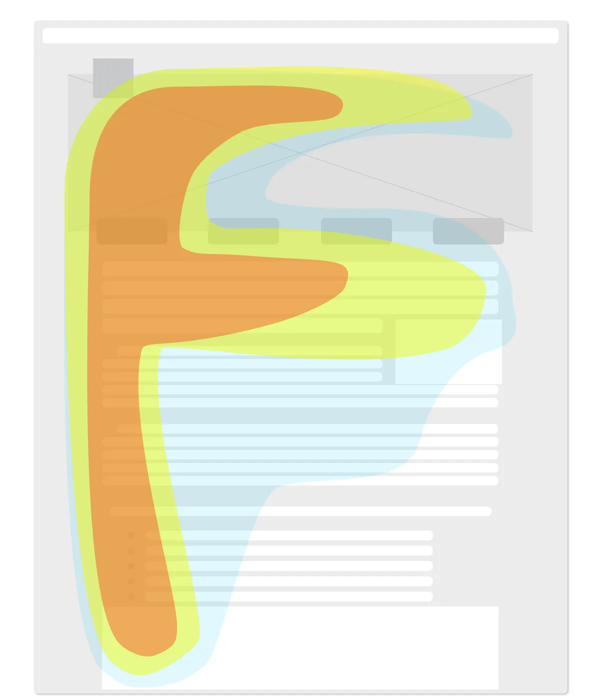
Users scan the content area of web pages in a roughly F-shaped pattern. This means that users will pay closer attention to the first lines of text on a page than the subsequent lines. It also means that the first few words of each line are more likely to be read than the words that follow. You can take advantage of this by front-loading important information, chunking content, and making sure it is easy to read.
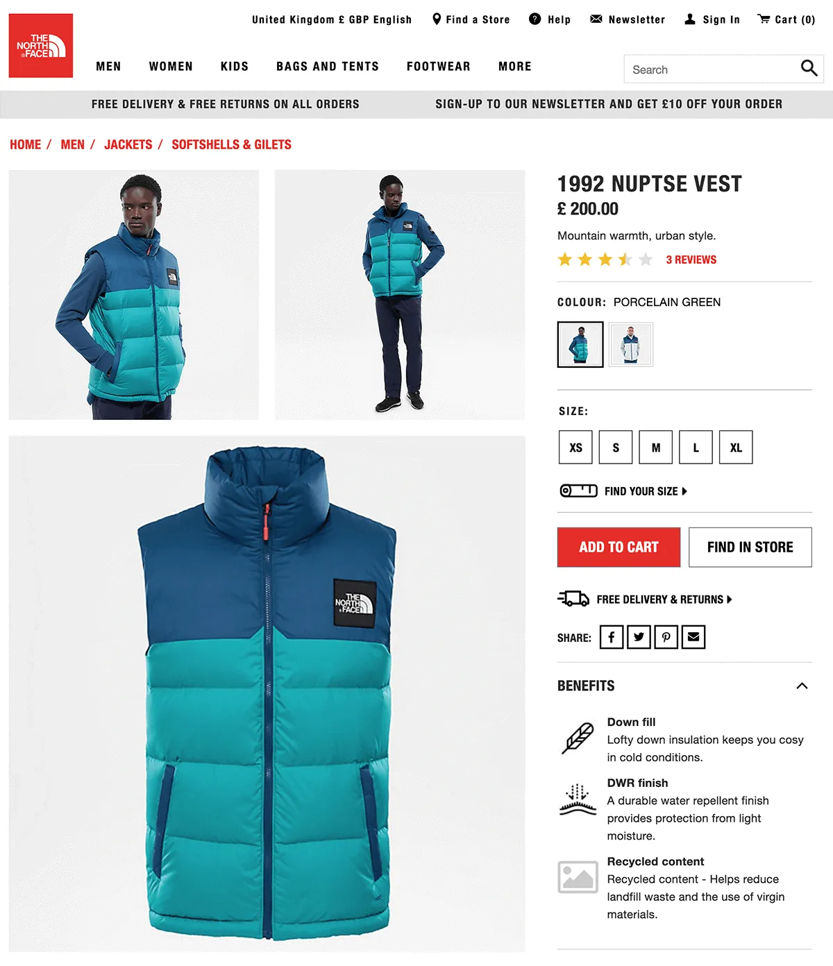
Front-load important information
Front-loading simply means putting the most important information at the beginning of a page, paragraph, or title. Journalists have used this technique since the early days of newspapers. It helps people understand what a piece of content is about without having to read all the way to the end and can help to catch their eye when scanning a page. Front-loading titles also helps with SEO as search engines give particular weight to the first few words in a page title.
Break content into chunks
You can help people to scan your page by “chunking” your content. Chunking involves breaking content into chunks of related information that are separated by whitespace. Presenting information in this way makes it easier for people to pick out what they are looking for, reduces cognitive load, and is far less daunting than a dense wall of text.
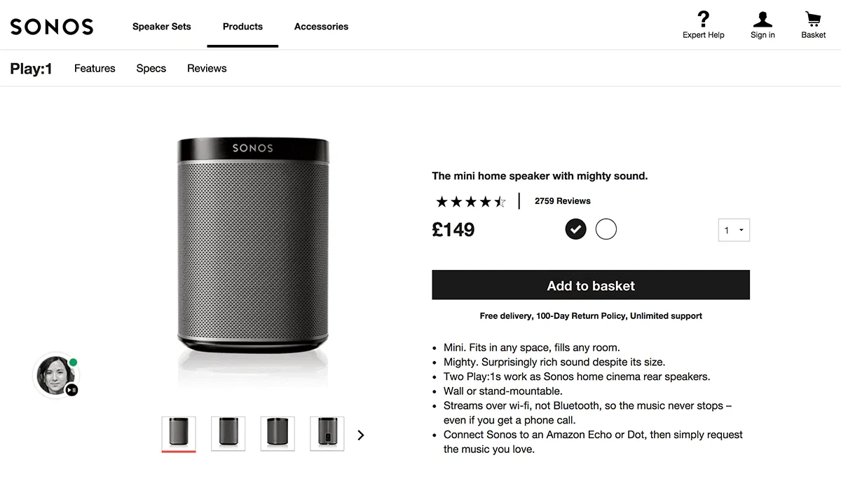
Some of the easiest ways to chunk your content include:
- Using short sentences
- Limiting each paragraph to one idea
- Breaking up the page using headings and subheadings
- Using bullet lists rather than paragraphs
E-commerce websites often use front-loading and chunking together to highlight information that companies think customers will find appealing.
Make it easy to read
The average reading age in the UK is around 9 years – with over 5 million adults classed as functionally illiterate. That means many of your users will struggle to read anything more complex than the average tabloid newspaper. For reference, this article has a reading age around 12.
Even if your visitors can read more complex text with a higher reading age, it doesn't mean that they will. Humans are lazy by nature. We're descended from hunter-gatherers who evolved over millions of years to seek the maximum benefit with the minimum amount of effort.
So, if you really want to get through to your visitors, it’s crucial that you increase the readability of your content.
You can make your content easier to read by:
- Using simple language – don’t use a difficult word when a more common one will do
- Keeping your sentences short – no longer than 14 words
- Writing in the active voice – the passive voice can be ambiguous and harder to comprehend
As more and more of us are using our mobile devices to get online, these techniques are even more important. Studies have shown that users take longer to read difficult content on mobile devices. It’s important to bear in mind that in these studies the participants were obliged to read the content from beginning to end. Your users are under no such obligation. If the costs of reading your content – time and effort – outweigh the benefits, they will give up.
Remember, your goal isn’t to encourage your visitor to read all the content on the page – it’s to make sure they leave with what they came for in the first place.
Make it accessible
Accessibility is one area in which ecommerce sites notoriously fall down. Most of us are well aware of the need to provide for people with visual impairments when building websites. After all, the web is a very visual medium. However, there are other disabilities – auditory, physical, and cognitive – that can affect how people use websites.
People visiting your website might have:
- Visual impairments such as sight loss, colour blindness, or sensitivity to bright light
- Deafness or other hearing problems, like tinnitus
- Physical disabilities and mobility problems – either permanent or temporary, such as a broken arm
- Cognitive disabilities, such as autism or dyslexia
- Speech disorders, such as stuttering or muteness
These can affect the way people use your website in lots of different ways – many of which you might not have considered. A visitor with hearing problems will either struggle or be unable to hear the audio on any videos on your website. A user with arthritis in their hands might be unable to use a mouse. Somebody with a cognitive disability, such as dyslexia, might need longer to complete forms.
Here are a few basic things to check:
- Colour contrast – low contrast text is difficult to read. Make sure text meets the minimum contrast standards using a contrast checker.
- Font size – font size affects colour contrast and legibility. People with visual impairments will also struggle to read small fonts. Make sure your font size is set to at least 16 pixels and that users are able to zoom in using their browser.
- Readability – people with cognitive disabilities might struggle to read content with a high readability score. Use a tool like Hemingway to check the readability of your content.
- Alt text – alt text helps visually impaired users make sense of non-text content. You should add alt text to images that convey information. You shouldn’t add alt text to decorative images.
- Videos – videos can be problematic for both visually impaired and deaf users. Provide transcripts for audio and video content – this will also make your content more visible to search engines. Add closed captions to help people with hearing problems make sense of videos that use audio to convey meaning.
- Screen reader support – visually impaired users rely on assistive technology like screen readers to access web pages. Developers should use semantic HTML elements and ARIA to make web pages easier to navigate with screen readers. Test your website using a screenreader such as NVDA (Windows only) or Apple’s VoiceOver (Mac only).
These steps don’t only improve the user experience for visitors with disabilities. All of us rely upon the accessibility techniques as some point. You might be in a hurry or distracted and struggle to comprehend content with a high reading age. Or, you might be on a crowded train and unable to play the audio on a video out loud. Don’t risk ruining a user’s experience – and losing a conversion – because you didn’t make a few simple improvements.
Make it responsive
We’ve now reached the tipping point where mobile device use has overtaken desktop use. In fact, according to research by comScore, users in the UK and US spend over twice as much time browsing on mobile than on desktop.
On top of this, Google has changed its algorithm and now considers your mobile site to be the primary version. Where in the past your desktop site determined how well both your desktop and mobile sites ranked, your mobile site is now the determining factor. In short, if your mobile experience is poor, your SEO could suffer.
It’s clear that a good user experience means providing a consistent experience for desktop and mobile visitors.
The simplest and easiest way to address this is to make your website responsive. A responsive website is one that works on any screen – from a tiny smartphone up to a widescreen desktop display. It’s easier to keep a responsive site up-to-date because you only have one website to maintain rather than separate mobile and desktop sites.
For more advice, check out my blog on how to improve your mobile user experience.
Make it fast
A slow site is deadly for an e-commerce company. Several years ago Amazon calculated that even a 1-second delay in page loading times could cost the company $1.6 billion. And according to a 2016 study, nearly half of visitors won’t even wait 3 seconds for a site to load.
This problem is only getting worse as more of us use mobile devices to access the web. Most people have 3G or 4G mobile data connections that are nowhere near as fast as the broadband we enjoy in our homes and offices. A page that loads in under 4 seconds over super-fast fibre broadband could take over 35 seconds to load over a slow 3G connection.
Thankfully, improving performance isn't that complicated. It's a case of considering the impact each change you make to your website will have on it's speed. Some of the common causes of slow loading times include:
- Images – large images can contain a lot of data that has to be downloaded to a visitor’s device when they load the page. You can reduce the file size of images by cropping them to the right size and compressing them with software like Kraken or ImageOptim before you upload them to your CMS.
- Videos – even a short video might contain over 100MB of data. If you upload this to your CMS and store it on the same servers as your website, it will put a huge strain on your hosting infrastructure. Instead upload your videos to a video-sharing service such as YouTube or Vimeo and embed them in your pages. Alternatively, use a content delivery network (CDN) to host your videos.
- Scripts, pixels, and plugins – all the analytics scripts, personalization pixels, and social sharing plugins that you add to a page increase the amount of JavaScript that has to be downloaded by a user’s browser. Decide which scripts are absolutely essential and ask your developers to defer them or load them asynchronously. Remove all the scripts you don’t need.
- Lazy-load content – loading images and other content at the top of a page first means visitors can start viewing the content while the rest of the page is loading. This technique is known as “lazy loading”. It gives visitors the impression that the page is loading faster than it actually is – and can stop them from abandoning your site in frustration.
- Hosting infrastructure – most websites are currently hosted on servers that use HTTP or HTTPS protocol to communicate over the Web. The latest HTTP/2 standard offers considerable speed advantages over the older protocols. It speeds up the site by allowing more assets to be downloaded concurrently and allows the server to push assets it thinks the user will need before they need them.
Some of these changes are easy to make. You can probably compress and reupload images yourself, for example. Others – like changing your hosting over to HTTP2 – are more technical and will require a developer. They are all important, though, and there’s little point in going after the kind of marginal gains you’ll get from things like lazy loading and infrastructure changes until you've got the basics right.
Conclusion
Good user experience design is all about making it easy for users to get what they need from your site. Don't make people work to find content. Fine tune your navigation and search and ensure your user journeys work regardless of where people land on your site. While you're at it, make sure your content is easy to read.
Allow people to access your website on their preferred device. Many people – especially those on lower incomes – rely on smartphones to access the internet. If your website isn't mobile-friendly you are excluding a large section of your audience.
Last but not least, make sure it's fast. Sure, your turnover may not be in the same ballpark as Amazon. But a 1-second delay in page loading times could still cost you 7% of conversions.
And, don't give up. Test your site regularly to make sure users can complete top tasks quickly and easily. Fix any problems that arise and test again. Never rest on your laurels.
